
Mobile Responsive Website
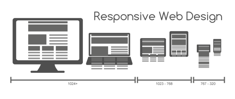
Now a days, as the consumers are switches to use from Laptop to ipad and Mobile to Smart phone then the website automatically changed their contain for resolution, Image Size, Scripting Abilities.
Responsive web site is like a water if you put water into glass it becomes the glass, if you put water into a cup it becomes the cup, If you open responsive website into mobile, tablets, laptop and desktop it respond based on device sizes and orientations.
Responsive web site is a technology for publish website that work on mobile, tablets, laptop and desktop. This technology is the approach that suggest that design content, images, grids, carousals and development should respond based on screen resolution, platform and orientations.
Design Digitally was established in 2010, we are professional company based on Ahmadabad city, India and we managed service throughout the world: India, USA, UK, Australia and more many countries. Our mission and vision is providing best quality work, customer satisfaction and Timely deliver work which is every client needed for projects.
Q. How to increase revenue from responsive website?
A. In lots of countries (USA, UK, Australia etc…) 70% users are using mobile and tablet devices for his/her browsing, Responsive design magically adjust itself to more comfortably fit the new width in across multiple platforms. This experience provides user to use website access easily and gain business leads.